


Creating a printed advertisement is never easy. You have to think about so many different elements – each element having the capacity to make or break your banner in the eyes of your target audience. But if you think about it, what is the primary aspect that makes a banner? Is it the font? Is it the size? Is it the information included on it? Whilst all these elements make a certain type of impact on your prospective audience, there is another element that makes a definite statement as well: the colours of your banner.
So before you even begin to think about your banner’s font and size and all those other aspects, you have to carefully consider the colors you would like to use first.
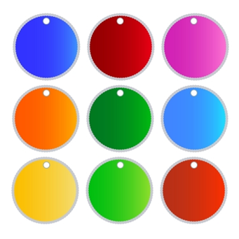
Colors and their Meanings
Did you know that different colors have different meanings in different parts of the world? If you are in the United States and Western Europe, for instance, you may already know that white is considered the symbol of purity and cleanliness. But in other countries, such as China, white is actually synonymous with death. With this in mind, you have to first consider your target audience or market. Where are you located? If you are in the UK, then you can very well use colors such as white, blue, and red for a patriotic image, whilst more somber colors can work as well.

The Psychology of Colors
Different colors can contribute to different emotions in your audience. For instance, the color red can evoke feelings of love and passion, but it can also evoke a feeling of caution. Whilst red may be a great color for products such as perfume or chocolate, it can be a bad color choice when it comes to finance-related services or medicines. In finance, red is considered a ‘financial loss’ colour, while in medicine, the colour red is symbolic for warnings or danger. If you have medical-related products, the colours green and blue are always a good choice.
How will your Audience perceive the Colours of your Banner?
Another important aspect to consider when choosing your banner’s colours is how your target audience’s eyes will be able to perceive these colours. As we all know, for instance, bold and bright colours can hold someone’s attention for more than a few seconds, whilst white colours or black shades or hues can only hold an individual’s attention for a mere second. Yellow may be the bold and bright colour of choice of many businesses, but too much of this colour can also repel your audience. As a matter of fact, if the colour yellow is over-used, your target customers may actually start veering away from your banner. The main aspect to remember is to make use of bright and bold colours but to accentuate this with the use of muted and more subtle shades as well.
Don’t be Afraid to Mix and Match
When selecting the right colours for your roller banner or other form of banner, banner specialists such as Roller Banners UK (find out more at https://www.rollerbannersuk.com) also suggest considering your company’s logo and your line of business or sector. If you are in the financial sector, for example, it would be good to stick with staid, serious and respectable colours such as navy blue, grey, and the like. However, don’t forget to use pastels as well – the key is to mix and match different hues and shades to come up with a banner that is not only striking, but truly effective in the end.